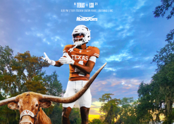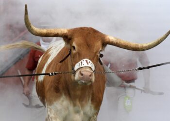



https://www.hornsports.com/wp-content/uploads/2012/10/hookem_osu.jpg It’s always Horns Up for Texas. Photo: Austin Pixels
Whether you attended the University of Texas or not and unless you have lived an incredibly sheltered life, you have seen it. The simple silhouette of a Longhorn head, burnt orange in color, that rakes in millions and millions of dollars for a powerhouse athletic program. Yeah THAT. THE Sacred Cow. Many NCAA programs are constantly working to re-brand themselves with new logos or colors to be more attractive to fans… Not Texas. They just ARE. In a Cartesian manner.
ADVERTISEMENT
On Friday Athlon Sports Art Director Matt Taliefero listed his top college football logos of 2013. Texas was #1. His thought on naming Texas #1:
The best logo in college football, the Longhorn is classic, simple, unchanging but also unique and creative. There is nothing else to say.
Well said Matt. Except you should have gone even further. #1 in 2013? I say hogwash. It’s the best and most recognized logo year-in and year-out.  Always will be.
Other notables from Taliefero’s list of best logos in 2013:
- Clemson was #2
- Kansas State was #17
- Oklahoma was #18
- Texas A&M was #19
Worst logos of the year:
- Oregon State #1
- Kansas #4
- Texas Tech #5