Welcome to the HornSports Forum

By registering with us, you'll be able to discuss, share and private message with other members of our Texas Longhorns message board community.

SignUp Now!

OT: HornSports OFFICIAL Supercalafragalistic Team Uniform Thread

Louisville introducing "Black Out" uniforms for their opening ACC game against Miami.

BvFm7o0CcAEKCZm.jpg


BZFNt4SCEAAMbo9.jpg
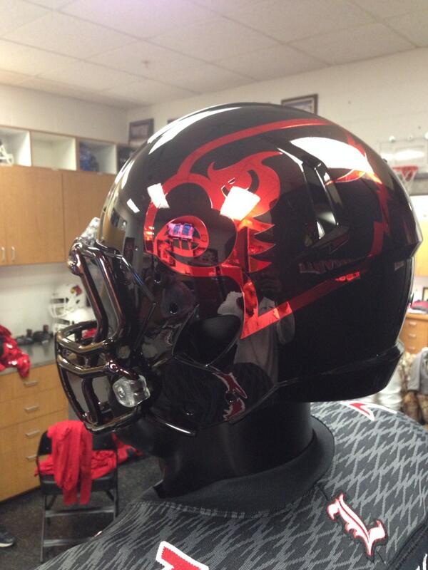
I hope Louiseville gets to face off against Kansas in the Ridiculous Bird Helmet Bowl played at the San Antonio Zoo. Stay classy.

 
Call me "old school", but I like UIW's original 2012 helmet best.  New copyrighted logo is clean and sharp...not to mention ornithologically-correct.  Go Cardinals!

— Twitter API (@twitterapi) November 7, 2011


Northern Illinois shows off their collection of generic adidas gear.  The all-red is new for the Huskies.  Meh...

BvM2GzgIUAAVKQ-.png


Last edited by a moderator:
Holy Toledo!  The Rockets got new UA uniforms this year.  

ButKDRsIEAA3gc0.jpg


Last edited by a moderator:
finally!   a beautiful under armour uniform.  however, the matte helmet is hideous.  i hate matte helmets!  period.
Yeah, I'm on the fence with the matte helmets.

Sometimes it looks good with darker colors like black, navy, BU's hunter green, and aggie's maroon.  Other times, not so good - especially red.  I think lighting has a lot to do with its overall appeal.  Guess we'll find out with ISU this year.

 
Last edited by a moderator:
Interesting article on the Philadelphia Eagles problems with Nike matching their custom "midnight green" with various fabrics, both metallic and matte.  Apparently, colors look more consistent under bright lights with a matte finish.  Learn something every day.

http://www.crossingbroad.com/2014/08/a-huge-little-issue-more-on-nikes-green-jersey-snafu.html
Good article JB!  Matching fabrics much harder than I thought, especially with the metallic colors.  

I'm not a fashionita but I know when types of fabric makes my butt look bigger.  I always thought UCLA should have metallic gold pants instead of matte gold. The matte gold is very unflattering to the lower body.  Same with the 49ers.  

USC-UCLA-Football-0001.jpg


They did have metallic gold pants for a short period of time:

ucla.jpg


The metallic gold pants are much tighter thus produces less of a muffin top effect.  

 
Last edited by a moderator:
The metallic gold pants are much tighter thus produces less of a muffin top effect.  
That is how UCLA is supposed to look with their metallic gold pants matching their iconic helmet!  The shoulder stripes are the right length, too, unlike today's.  The Bruins had my favorite CFB home uniform until adidas screwed 'em up.

hi-res-104387609_crop_650x440.jpg


Last edited by a moderator:
Good article JB! Matching fabrics much harder than I thought, especially with the metallic colors.

I'm not a fashionita but I know when types of fabric makes my butt look bigger. I always thought UCLA should have metallic gold pants instead of matte gold. The matte gold is very unflattering to the lower body. Same with the 49ers.

USC-UCLA-Football-0001.jpg


They did have metallic gold pants for a short period of time:

ucla.jpg


The metallic gold pants are much tighter thus produces less of a muffin top effect.
We definitely don't want to play vs UCLA in Arlington if they are sporting

Muffin tops. Oh wait, maybe they will play worse if their butts and hips don't look flattering! Seriously, UCLA does have a classy uniform pedigree when done correctly as with JBs prior post.

 
Back
Top Bottom