BudreauReye
Veteran
- Joined
- Nov 17, 2013
- Messages
- 1,723
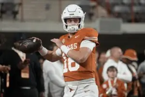
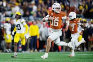
I do too. Burnt orange numerals, letters, and strips ... maybe leggings.I like the all black look myself.

By registering with us, you'll be able to discuss, share and private message with other members of our Texas Longhorns message board community.
SignUp Now!I do too. Burnt orange numerals, letters, and strips ... maybe leggings.I like the all black look myself.
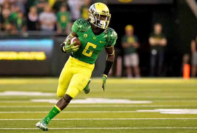
Agree, some of their offerings are OK, they had a cool matted gray helmet at one point that I liked. Is a bit ridiculous to have a clone of Donald Duck on your helmet which I believe was an old school option. I just don't like the multi-pattern and color look, I do like solid color designed helmets and jerseys. Am I getting old? Today's kids have poor music taste and need to get off my lawn!Agree with most of UO's unis, but I actually liked these because they're in school colors. The Ducks don't have a distinguished history as a traditional CFB power, so newfangled uniforms are their niche. Nike CEO, Phil Knight, uses them as his personal experimental lab.

I would like that QB back on the roster!I would like them to wear the old black QB practice jerseys..love those


I guess all of the 4-5 star kids will now want to suit up for Dartmouth because of these new trendy uniforms! All of the old school Ivy League stars of decades ago turning over in their graves as we speak. Actually this offering is not bad, Ivy league unis always look like high school uniforms previously. I also appreciate that it is actually worn by a human instead of those creepy mannequins I have seen sporting other teams uniforms on this thread.Dartmouth Big Green new Nike uniforms.
I like the all black look myself.
I put two together some time ago for some folks on HornSports that wanted to see a Black Set. I only posted one of them. (The one you see above) This is the other.I do too. Burnt orange numerals, letters, and strips ... maybe leggings.

Quoted for awesomeness.Whites are Storm Troopers, Blacks are Darth Varders, would all Burnt Orange be Hans Solo?
I like both of these AND the all Burnt Orange ones ... they are all simple like our current all whites. I would not want them to be candied up any more than this though.
I think these would be badass
I try to find the line between modernizing a uniform set whilst also paying homage to the tradition of the school and their uniforms. I've always been a fan of Texas finding an alternate that's a bit more updated but like others, I think Texas has a tradition to uphold. I created and posted another Texas set months ago that I called the Texas Grays. They're about as candied up as I'd ever be willing to go.I like both of these AND the all Burnt Orange ones ... they are all simple like our current all whites. I would not want them to be candied up any more than this though.
/cdn1.vox-cdn.com/uploads/chorus_asset/file/653472/Screen_Shot_2014-08-13_at_2.58.29_PM.0.png)