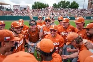
I was really happy to be able to share some of my Uniform Concepts with you all over the past weeks. I was surprised by the warm welcome those Concepts received, given how untouchable Texas is in the Uniform department. With that, I decided I wanted to venture out a little bit in my Collegiate Sports themed designing. I plan on doing a series of shirts for all of the teams in the BIG XII. Obviously, I couldn't start with anyone other than the Burnt Orange. I want to get honest opinions on this shirt. Do you like it? Would you wear it? Is it something you'd buy? What would you change? What do you like? Etc. Etc. With no further ado:
greetings bevoblake, much obliged as per you allowing your "horn sports" family to offer a bit of "critique" as per you newest t-shirt creations. should i be in your position... i would certainly perform the same courtesy. albeit, many of my pals, family members, and acquaintances are always venturing my way as per "fashion" points and advice. therefore, i shall be more than happy to offer a bit of "critique" along with my fellow "horn sports" members, as per your request:
1. please make certain that the overall "burnt orange" coloring is hereby (deep and rich). there is nothing worse to "texas" fans, than a faulty colored "burnt orange" t-shirt. fans, shall patronize you big time... but item quality should always be a top priority.
2. please get with your printer immediately about "paint" quality. the "faded" look just does not speak "quality". (not to mention) it washes away fast during the wash. "fans" shall surely turn away as per your product upon the future. please know, that whenever i venture into a store in search of a "texas" t-shirt... i want something that shall "stand apart" as per all of the rest. i want good heavily painted graphics that shall last with great "fonts" etc.. please bare in mind "bevoblake"... "texas" is a very conservative state with conservative minded citizenry... "less is always more"! deep rich coloring, good quality long lasting paint, and great fonts.
3. upon this particular item... dispose of the (the) - broaden "longhorns" make it stand out big time - add a large solid "star" below the "longhorns" - inside the star add "1883" with deep burnt orange paint - get rid of the "framing" around the wording - always remember... with "texas" (less is indeed more) - i like the "xiii" upon the left shoulder, but make it a bit larger with heavy paint to make it stand out a bit more - no need as per the "silhouette" upon the right sleeve - "less is indeed more" - i like the "hook 'em" inside of the collar - innovative approach
4. very important - i am not at all abreast as per your prospective budget for these items. but your "sizes" are indeed very important. many retailers tend to think that if they offer "sizes" as per (sm, med, large, xl) then that is all it takes - perform a bit of due diligence, and you shall come find that it's the larger sizes that are actually selling (xl, xxl, xxxl, etc) - many many patrons such as myself included LOVE larger good quality t-shirts... because of the element of making a good overall quality purchase - as well as getting your "money's" worth.
5. bevoblake, thank you as per allowing us members to assist as per your item critique. this is a great approach to marketing your prospective products. just bare in mind my aforementioned steps... and see where they shall lead you. get with your printer, inquire about a good quality paint that "stands out". cover your t-shirt with great "fonting" that stands out amongst the crowd. (people want to be noticed as per their t-shirts) - keep it simple always follow the (less is more) approach to "texans" - offer larger "sizes" for fans like myself that love to purchase BIG t-shirts - not everyone loves to place themselves in "skin tight" apparel - "texas" can be extremely hot at times... and fan's want to feel cool at the games.


")